BRAND IDENTITY REDESIGN
the foam guy
about the foam guy
The Foam Guy was looking for a new look for their company while keeping the familiarity of their previous logo for their existing client base. Throughout this project, I worked on finding a balance between the new modern style of logos and the family-based feel that their previous logo incorporated. This was my first time designing a logo including a character, and it was a great experience. I appreciated the opportunity to explore a few different logo and brand design aspects through this project.
design objectives
The design objective for The Foam Guy logo redesign was to modernize the company's existing logo while preserving a sense of familiarity for current customers. I accomplished this by researching the client’s competitors and identifying what distinguishes them in the industry: family. Keeping this in mind, I incorporated an illustration of the founder and owner, John Day, and opted for bold, rounded sans-serif fonts to ensure the branding feels approachable and familiar.
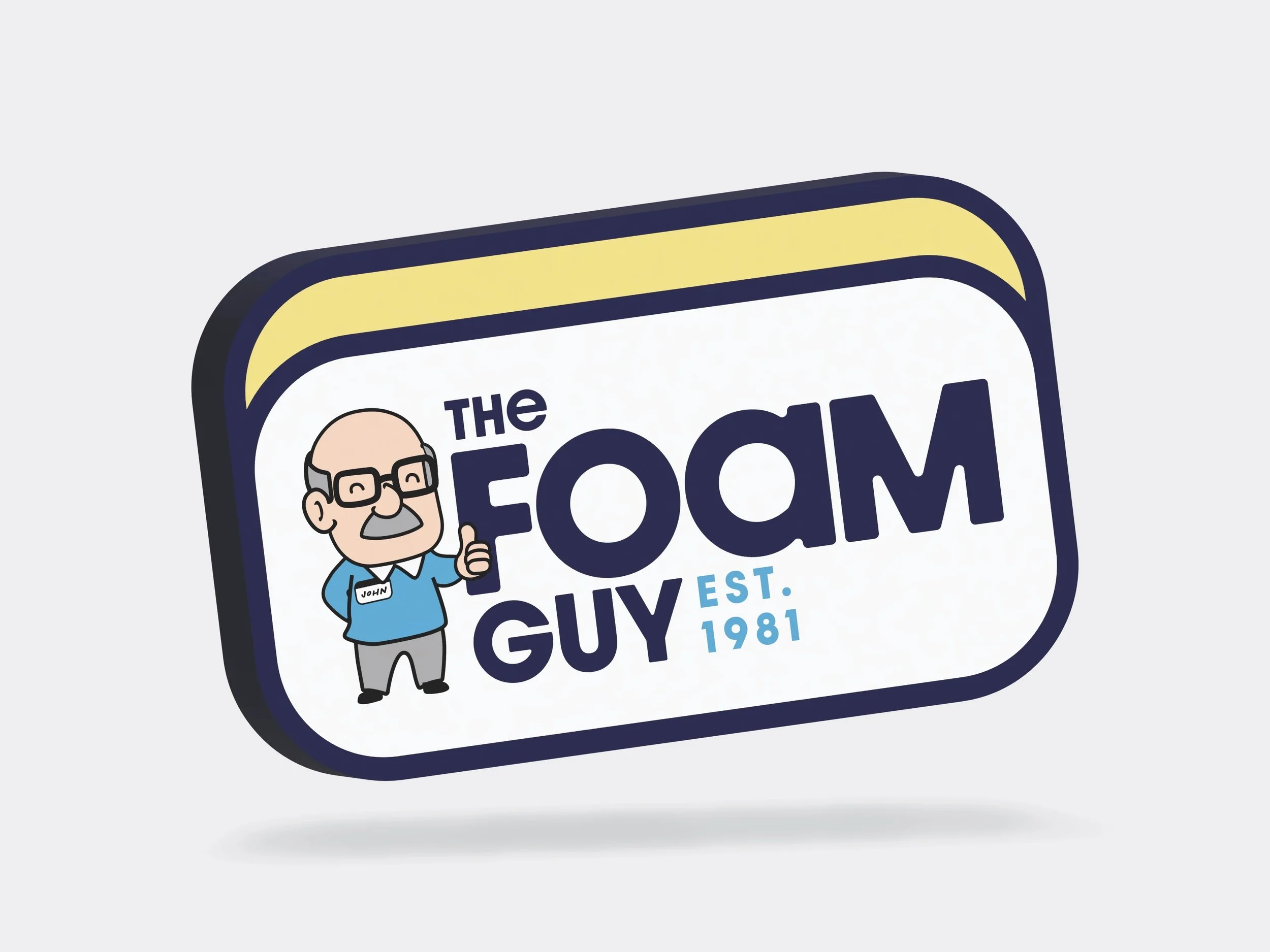
logo redesign
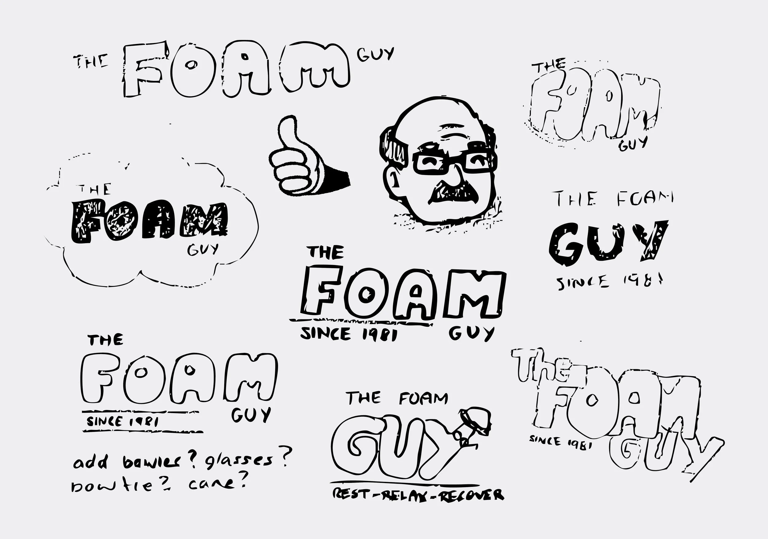
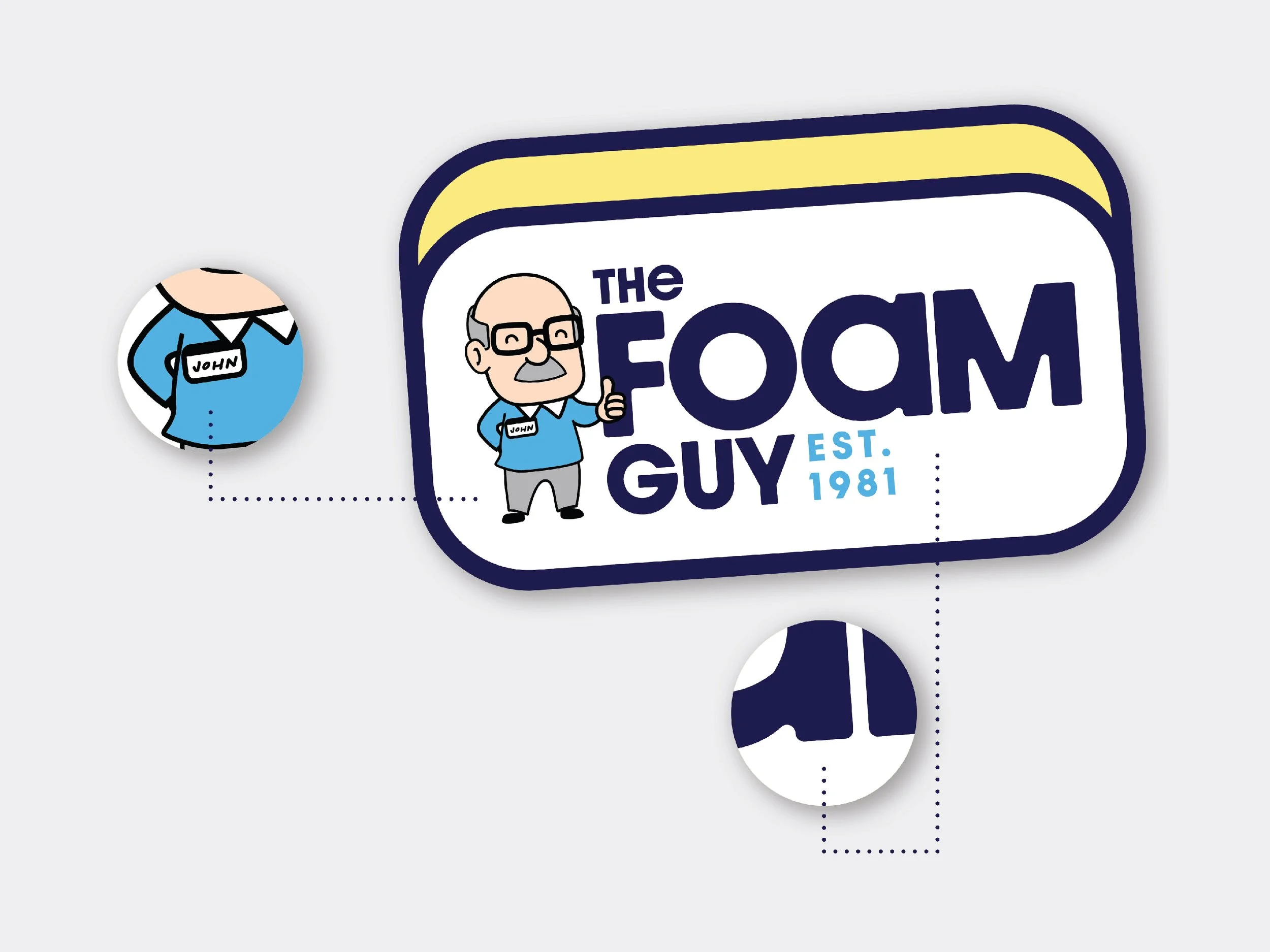
When building out The Foam Guy's primary logo, I started by sketching any and all ideas that came to mind and started my refining process. I decided I wanted to incorporate a cheerful cartoon of John Day, the company’s founder, giving a thumbs-up to show the friendly and community-focused values of the business. Keeping the same logo in a shape feel from their previous logo is an aude to their past, while the new rounded border sans-serif typefaces and playful design highlight the company’s welcoming and family-focused approach.

brand colours
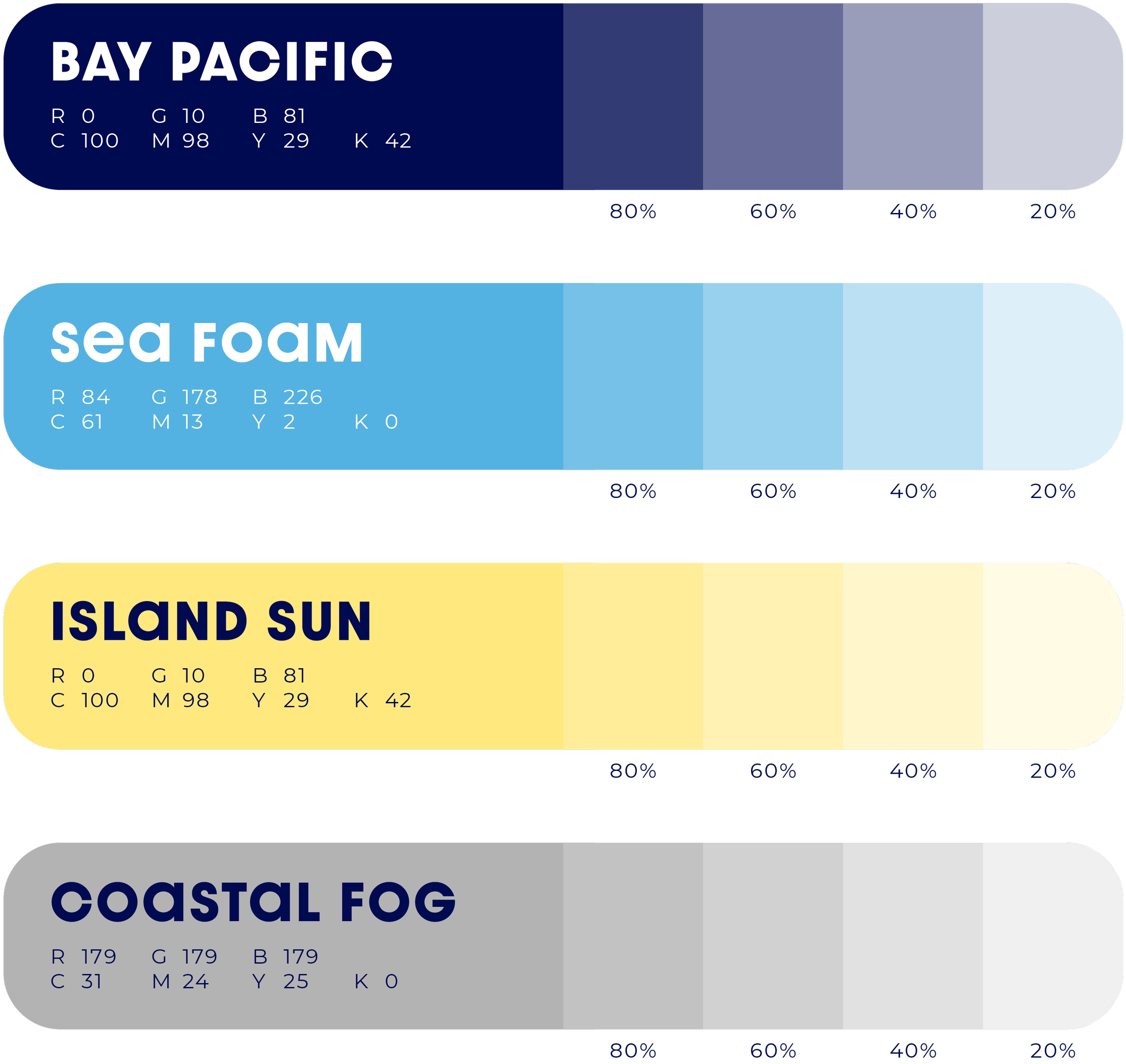
Bay Pacific and Sea Foam serve as the primary brand colors. These blues represent trust, professionalism, and comfort, while also tying in the brand to its coastal roots and reinforcing its mission to provide custom comfort solutions.
The secondary colors, cheerful Island Sun Yellow and balanced Coastal Fog gray add warmth and versatility to the brand's colour palette.
Shades of these colours are allowed, in increments of 20% ranging from 20% to 80% opacity. The brand logos must always be 100%.
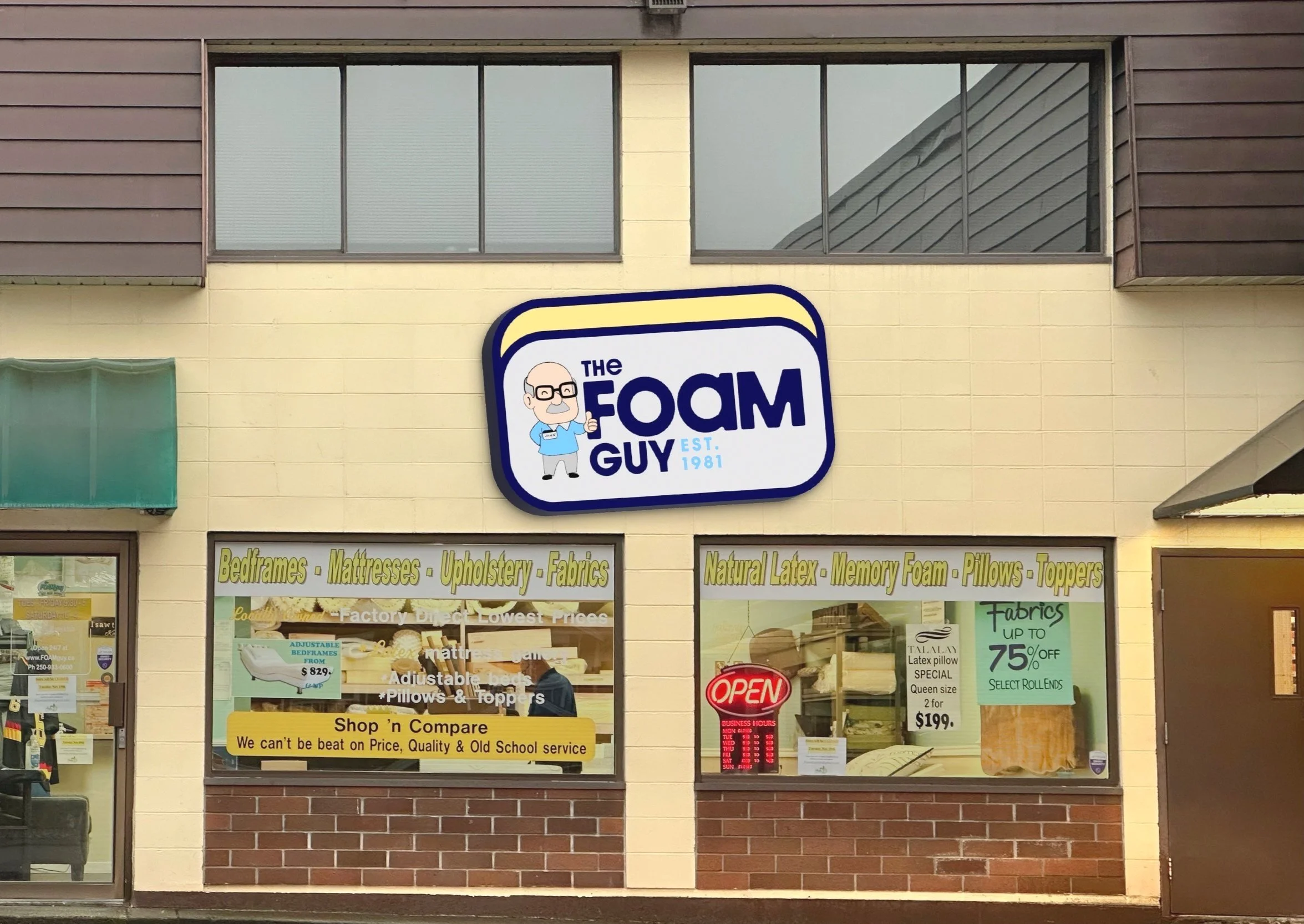
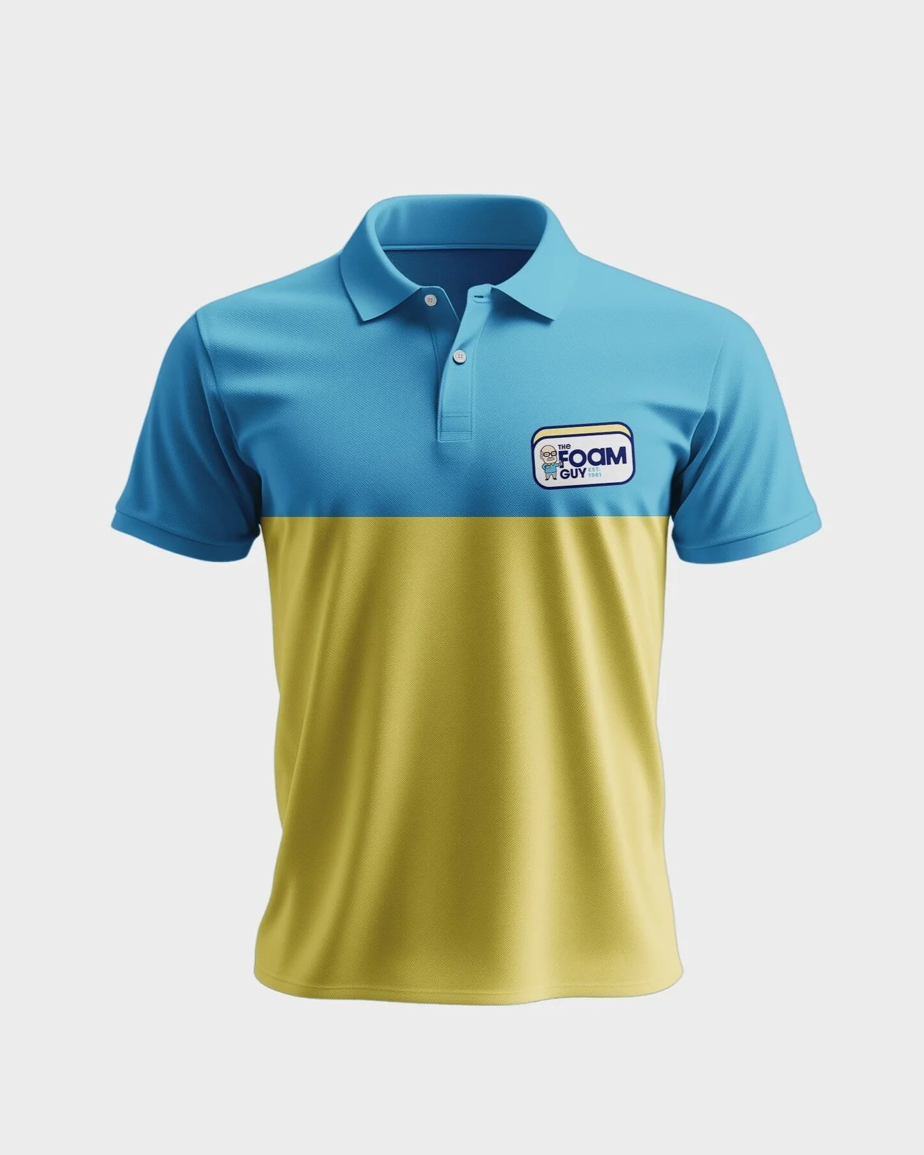
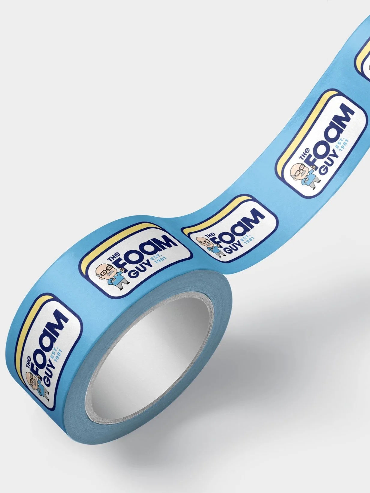
brand collateral
Consistency is key when it comes to branding! The Foam Guy’s collateral ensures a strong, recognizable presence across every touchpoint. From the storefront sign to the delivery truck, uniforms, and even branded packing tape, every detail reflects the brand’s identity. A cohesive look builds trust, professionalism, and a lasting impression—because great branding goes beyond just a logo!